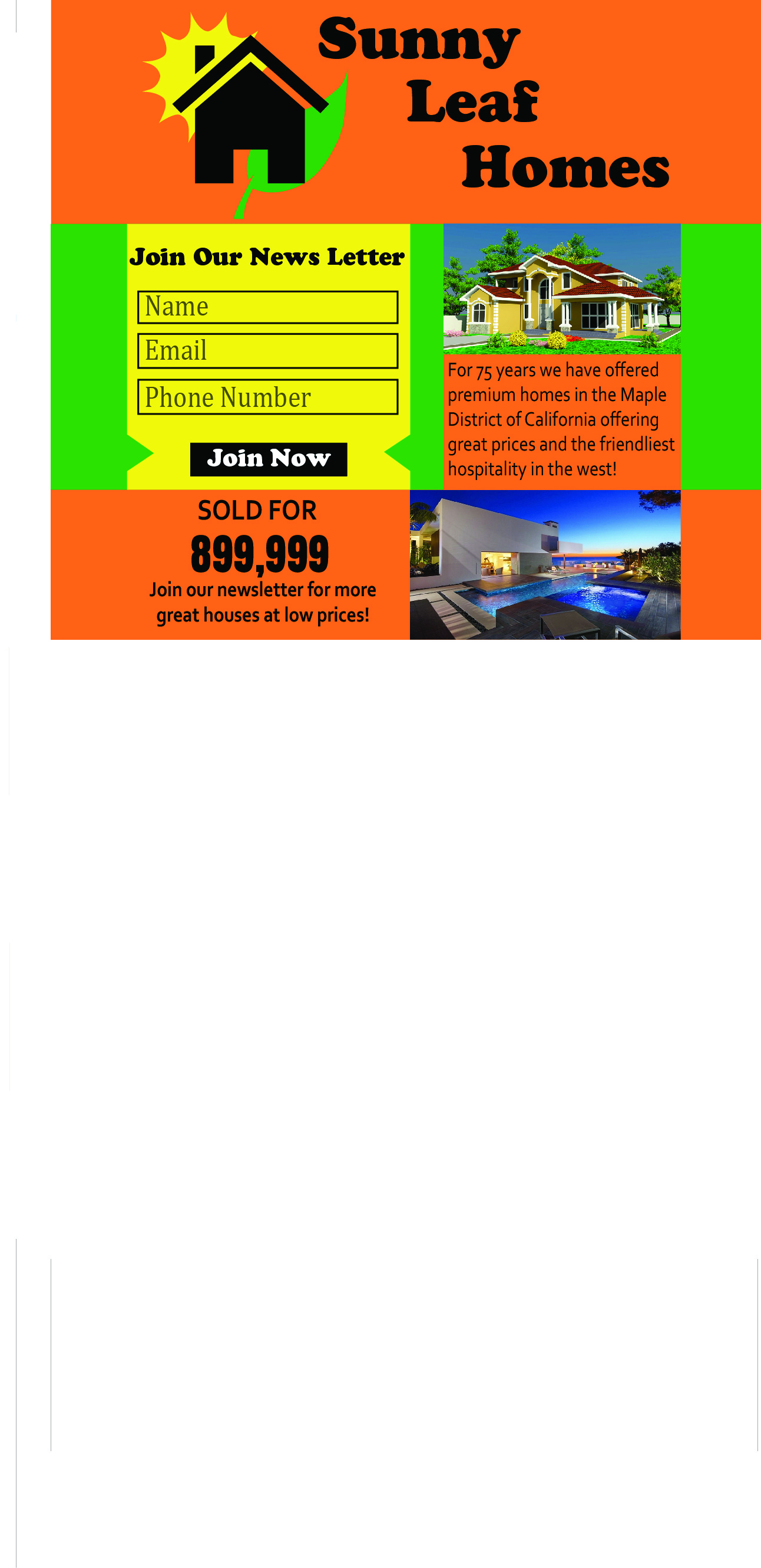
I chose this design, because it is simple and staight to the point. It gives the users the basic information they need about the company, who they are and what they do. I made it clear how to join the news letter and why they wanted to. i used contrasting colours to make things pop on the page and draw attention to the main goal. I indented the box by join now to guide the users eyes to the button. Overall I feel that it is conversion approved.